Part 1: Customized Column Overview
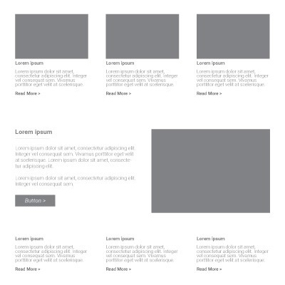
Section Type: Customized ColumnThis section is a highly flexible layout engine. It allows you to create grids ranging from 1 to 6 columns, with specific width ratios to control how much space each column takes up. It is the backbone of your page structure, turning blank space into organized, digestible content areas.
Key Layout Strategies:
- 1 Column (Full Width): Ideal for hero sections and announcements to maximize user focus.
- 2 Columns (Split View): Best for "Image + Text" combinations. Use 1:1 for balance or Golden Ratio (3:2) for natural reading flow.
- 3 Columns: Perfect for service lists or team members, leveraging the "rule of three" for clarity.
- 4 - 6 Columns: Designed for compact content like client logos or portfolio galleries.
Part 2: Use Cases & Strategic Layouts
Choosing the right column structure depends on the type of content you want to present. Here is a guide on when to use specific layouts:
- 1 Column (Full Width) – "The Storyteller": Best for hero sections, large banners, or important announcements where you need maximum space and visual impact.
- 2 Columns (Split View) – "The Comparer": Ideal for "Image + Text" combinations, before/after comparisons, or highlighting specific features side-by-side.
- 3 Columns – "The Feature Grid": Perfect for displaying service lists, product features, or team member profiles in a clean, organized grid.
- 4 to 6 Columns – "The Gallery & Stats": Best suited for displaying client logos, portfolio galleries, or data statistics where smaller, uniform boxes are needed.
Part 3 : How to Configure Your Section
Our backend system provides a comprehensive set of tools to customize your content blocks. Follow these steps to set up your layout perfectly:
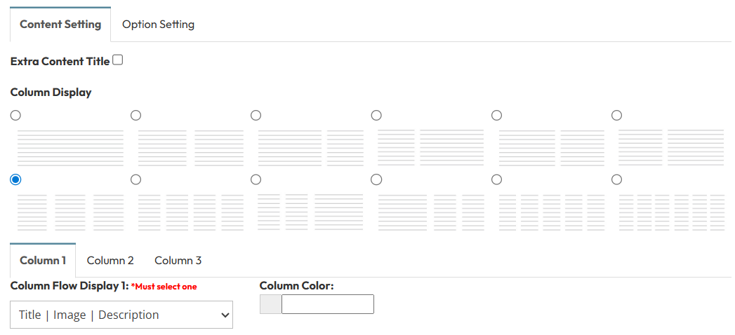
Step 1: Column Configuration
Choose the Layout Matrix- Layout Matrix: Select the column structure from the matrix (1 Column, 2 Columns, 3 Columns... up to 6 Columns).
- Selecting a layout will generate the corresponding configuration boxes below. You can set different widths for each column (e.g., Left 70% | Right 30%).
Step 2: Header and Images Settings
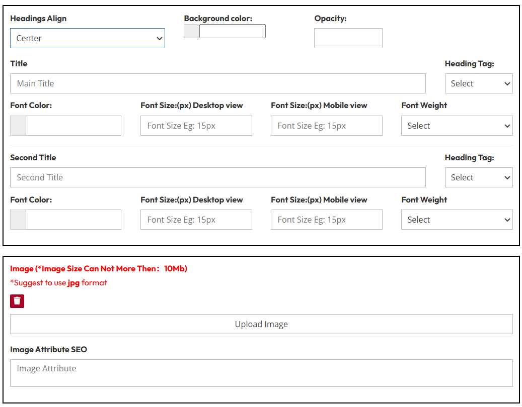
Headings & Style:
- Headings Style: Select a predefined style (Style 1 – Style 8).
- Headings Align: Set the text alignment independently for different devices. (e.g. Left, Center, Right)
- Header Image:
- Add Image?: Toggle Yes to include an icon or logo image within the column header.
Main Title Configuration
Configure the primary heading text.
- Heading Tag: Select HTML tag (H1, H2, H3, etc.) for SEO hierarchy.
- Font Color: Pick a text color.
- Font Size (Desktop): Enter size in px (e.g., 32px).
- Font Size (Mobile): Enter size in px (e.g., 24px) for responsive scaling.
- Font Weight: Select thickness (e.g., Normal, Bold, 600).
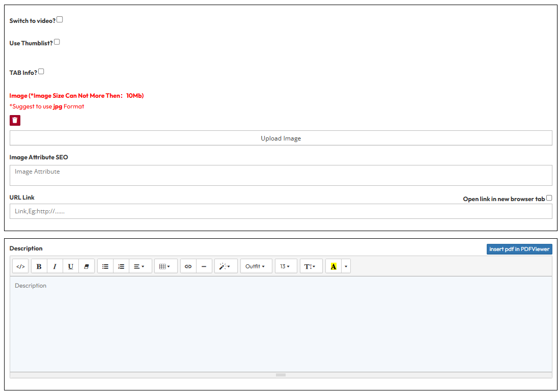
Step 3 : Content & Actions
- Switch to video?: Toggle to replace the standard image with a video player in this column.
- Use Thumblist?: Toggle to enable a thumbnail list style within the column.
- TAB Info?: Toggle to enable tabbed content within this column.
- Media:
- Image: Upload the image (Max 10MB, JPG recommended).
- Image Attribute (SEO): Fill in Alt Text and Title for SEO.
- Linking:
- URL Link: Add a link to the column content.
- Open link in new browser tab: Toggle Yes/No.
- Description: Enter the main text content.
- Call to Action (CTA) Button:
- Use Button: Toggle to show a CTA button (e.g. button title and link).
- Open link in new browser tab: Toggle Yes or No on the button.
Part 4 : Customized column (Option settings)
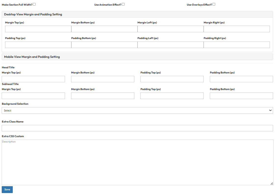
- Make Section Full Width?
- Expand the section to stretch across the entire screen width, removing standard side margins.
- Use Animation Effect?
- Activate visual effects (like fade-in or slide-up) that appear when the user scrolls to this section.
- Use Overlays Effect?
- Apply a color tint or gradient layer on top of the column background image or color.
- Desktop View Margin and Padding setting
- Adjust external (Margin) and internal (Padding) spacing for Top/Bottom and Left/Right.
- Mobile View Margin and Padding setting
- Adjust spacing values specifically for mobile devices to fit smaller screens.
- Head Title & Subhead Title
- Adjust the spacing (Margin) above and below the Main Title and Subtitle text.
- Background Selection
- Default: Uses the standard site background (usually transparent or white).
- Background Color: Fills the section with a solid color of your choice.
- Background Image: Upload an image (Recommended size: 1920x500px).
- Parallax Effect?: Toggle Yes to create a 3D scrolling effect where the background moves slower than the content.
- Background Image with Color: Combines an image with a colored overlay.
- Opacity (1-0.1): Controls the overlay strength (1 = Solid color, 0.1 = Mostly image).
- Extra Class Name
- Enter a custom CSS class name to apply specific styles.
- Extra CSS Custom
- Paste custom CSS code here to override default styles for this section.