Part 1: Slider Overview
Section Type: SliderThe Slider section is a web design element designed to showcase visual content. It offers two distinct approaches to displaying images and information, allowing you to choose the best fit for your page layout and user experience goals.
When to use the Slider?
- Best for: Homepage hero banners, promotional highlights, featured testimonials, or storytelling sequences.
- Why: This mode focuses user attention on one item at a time. It utilizes animations and transitions to guide the viewer through content sequentially.
Part 2: How to Configure Your Section
Our backend system provides a comprehensive set of tools to customize your content blocks. Follow these steps to set up your layout perfectly:
Step 1 : Slider Content Settings
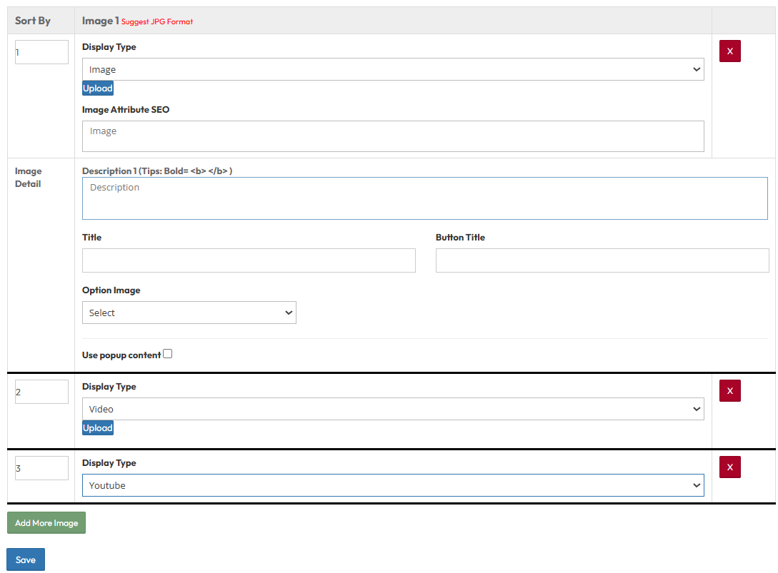
Add and configure individual slides within the slider list.- Sort By: Set the order of the items (e.g., 1, 2, 3).
- Display Type: Select the media format for this slide: Image, Video, or Youtube.
- Image Attribute (SEO): Enter Alt Text and Title for search optimization.
- Image Detail :
- Description: Enter the supporting text.
- Title: Enter the main headline for the slide.
- Button Title: Enter the text for the call-to-action button.
- Use Popup Content: Open the content in a popup window when clicked.
Mode 1 : Slider With Carousel
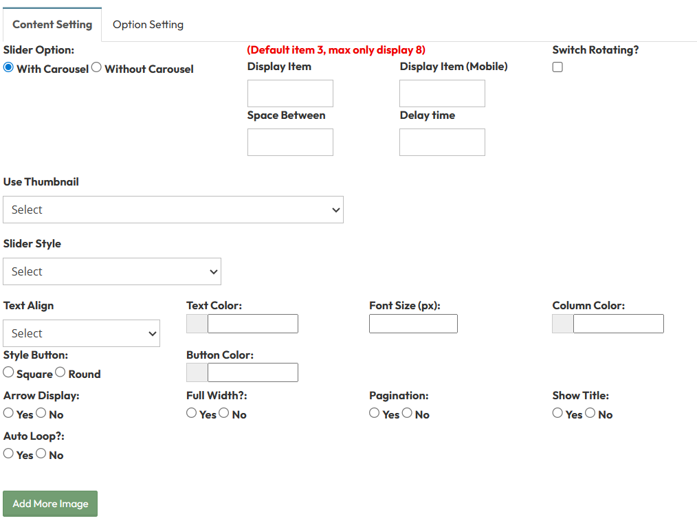
Choose your display mode and configure the layout using the settings below.A. Mode Selection
- Slider Option: Choose between With Carousel
B. Carousel Settings
- Display Item: Set the number of visible items per view on desktop.
- Display Item (Mobile): Set the number of visible items on mobile screens.
- Space Between: Enter the gap width between slides.
- Delay Time: Set the duration (seconds) between auto-rotations.
- Switch Rotating?: Toggle Yes to enable auto-play.
- Use Thumbnail?:
- Yes: Enables thumbnail navigation. (Shows Thumbnail Column setting).
- No: Continue with standard navigation settings.
- Slider Style: Select the visual style preset for the slider.
- Text Align & Color: Set text alignment and color for overlay text.
- Font Size: Define text size in pixels.
- Column Color: Set the background color for the text container.
- Style Button: Select the button shape (Square or Round).
- Button Color: Select the color of navigation buttons.
- Arrow Display: Toggle to show left/right navigation arrows.
- Full Width?: Toggle Yes to stretch the slider to screen edges.
- Pagination: Toggle to show bottom navigation dots.
- Show Title: Toggle to display the item title.
- Auto Loop?: Toggle to restart the slider from the beginning after the last slide.
Mode 2: Slider Without Carousel
A. Mode Selection
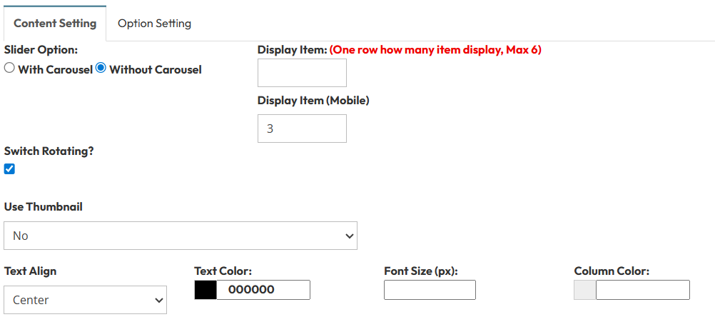
- Slider Option: Choose Without Carousel.
B. Without Carousel
- Display Item: Set how many items appear in one row.
- Display Item (Mobile): Set the number of items for mobile screens.
- Switch Rotating?: Toggle Yes to enable rotation (though typically disabled for static grids).
- Use Thumbnail: Toggle to enable thumbnail navigation.
- Text Align & Color: Set alignment (left,center,right) and text color.
- Font Size: Define the text size in pixels.
- Column Color: Set the background color.
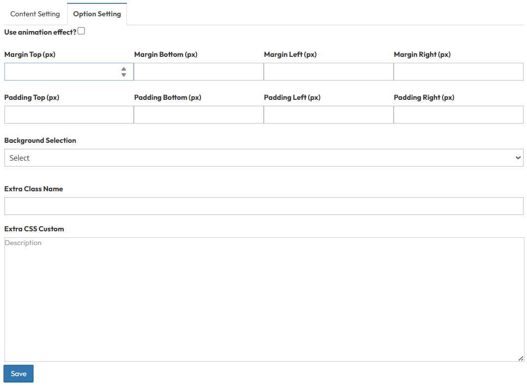
Step 2 : Slider (Option Setting)
Control the layout container and background design.Use animation effect?
- Enable fade-in or slide-up animations when scrolling to this section.
Margin and Padding setting:
- Adjust external (Margin) and internal (Padding) spacing for Top/Bottom and Left/Right.
Background Selection:
- Default: Uses the standard site background.
- Background Color: Fills the section with a solid color.
- Background Image: Upload an image (Recommended size: 1920x500px).
- Parallax Effect?: Toggle Yes to create a 3D scrolling effect.
- Background Image with Color: Combines an image with a colored overlay.
- Opacity (1-0.1): Controls the overlay strength (1 = Solid color, 0.1 = Mostly image).
Extra Class Name:
- Enter a custom CSS class name for specific styling.
Extra CSS Custom:
- Paste custom CSS code to override default styles.