Part 1: Testimonial Section Overview
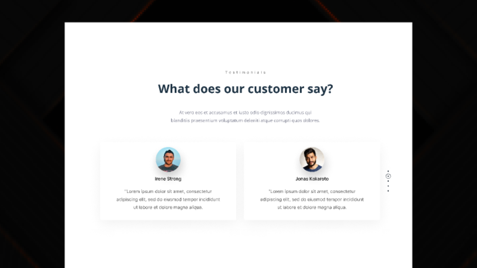
Section Type: TestimonialTestimonial section builds trust and credibility by displaying customer reviews or client feedback. It automatically pulls testimonial entries from the data list, featuring avatars, star ratings, and detailed quotes. It offers flexible layout styles to match your page design.
Key use cases:
- Landing Pages: Add social proof to key conversion pages (like pricing or product pages) to reassure potential customers.
- Service Success Stories: Highlight specific feedback related to different services or product lines on their respective detail pages.
Part 2. How to Configure Your Section
Our backend system provides a comprehensive set of tools to customize your content blocks. Follow these steps to set up your layout perfectly:
Step 1: Testimonial Info
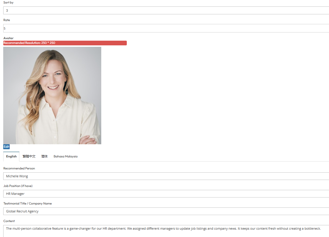
To populate this section, you must first create your testimonial items in the backend.Navigation: Go to Data List > Testimonial > Click Add Testimonial
After click add testimonial button, these are the field need to fill inside:
- Testimonial Info Fields: For each item, you can configure:
- Sort by: Enter a number to define the display order (e.g., 1, 2, 3).
- Rate: Set the star rating (e.g., 5 stars).
- Avatar: Upload a photo of the reviewer. (Recommended Resolution: 250 * 250 pixels.)
- Languages: Input content for English, Traditional Chinese, Simplified Chinese, and Bahasa Malaysia.
- Recommended Person: The name of the client or reviewer.
- Job Position: Enter the job title (e.g., HR Manager).
- Testimonial Title / Company Name: The company name associated with the testimonial.
- Content: The main body of the testimonial.
Step 2: Configure Page Layout (Content Settings)
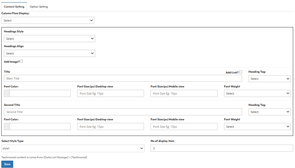
Configure the visual appearance of the testimonial section on the page.Navigation: Go to Page List > Select your page > Testimonial Section.
A. General Settings
- Column Flow Display: Choose the layout orientation:
- Title | Image
- Image | Title
- Headings & Typography: Configure the Heading Tag, Font Color, Font Size, and Font Weight for the Main Title and Second Title.
B. Layout Styles
Select a style that best fits your page design. Each style offers unique customization options:
- Style 1
- No. of Display Items: Set the maximum number of testimonials to show.
- Style 2
- No. of Display Items: Set the maximum number of testimonials to show.
- Layout Option: Choose between "Left Title, Right Testimonial" arrangement.
- Style 3
- Layout Arrangement: Select a specific design structure.
- Colors: Customize Title Color and Content Color.
- Background: Upload a custom image to use as the testimonial card background.
- Style 4
- No. of Display Items: Set the maximum number of testimonials to show.
- Colors: Customize Title Color and Content Color.
- Typography: Define specific Font Sizes for both the Title and Content text.
Step 3: Global Option Setting
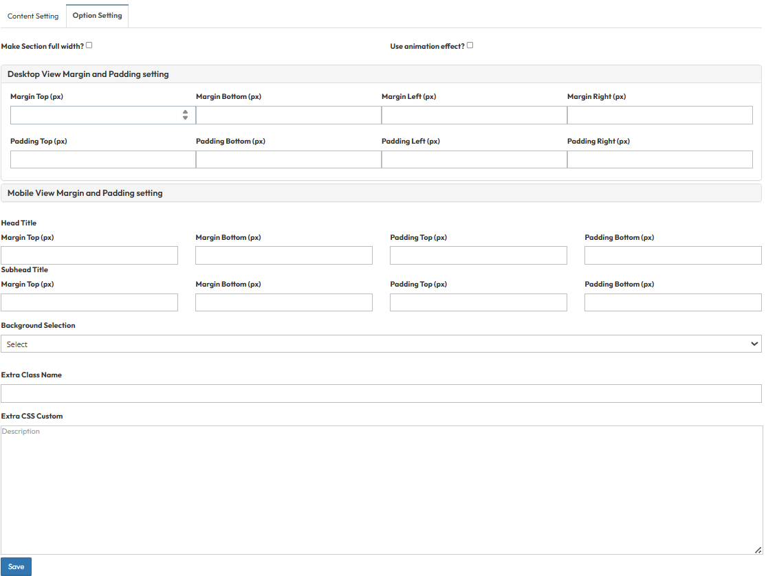
- Make Section full width?
- Stretches content to the screen edges.
- Use animation effect?
- Enable fade-in or slide-up animations when scrolling to this section.
- Desktop View Margin and Padding:
- Adjust external (Margin) and internal (Padding) spacing for Top/Bottom and Left/Right.
- Mobile View Margin and Padding:
- Adjust spacing values specifically for mobile devices.
- Head Title & Subhead Title:
- Adjust the spacing (Margin) above and below the Main Title and Subtitle text.
- Background Selection:
- Default: Uses the standard site background.
- Background Color: Fills the section with a solid color.
- Background Image: Upload an image (Recommended size: 1920x500px).
- Parallax Effect?: Toggle Yes to create a 3D scrolling effect.
- Background Image with Color: Combines an image with a colored overlay.
- Opacity (1-0.1): Controls the overlay strength (1 = Solid color, 0.1 = Mostly image).
- Extra Class Name:
- Enter a custom CSS class name for specific styling.
- Extra CSS Custom:
- Paste custom CSS code to override default styles.