Part 1: Thumblist Category List Overview
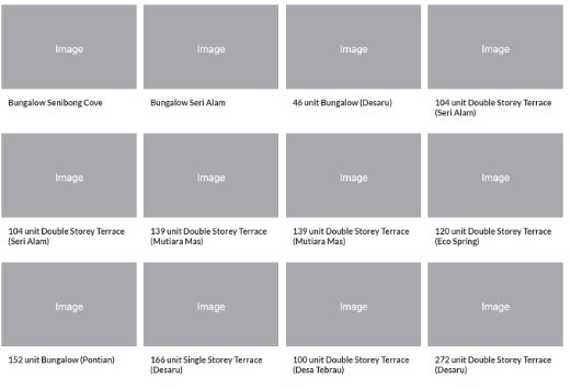
Section Type: Thumblist Category ListThis section serves as a visual navigation hub. Instead of a simple text menu, it displays your content categories as a grid of attractive cards. Each card features a representative image and title, allowing users to easily browse and filter content by interest. It supports multi-language content and various grid layout options.
Keys use case:
- Resource Hubs: Organize articles or blogs by topic (e.g., Tutorials, Case Studies, News).
- Portfolio Showcase: Display projects by industry sector (e.g., Healthcare, Finance, Retail).
- Product Collections: Allow customers to shop by collection or brand using visual cues.
Part 2 : How to Configure Your Section
Our backend system provides a comprehensive set of tools to customize your content blocks. Follow these steps to set up your layout perfectly:
Step 1: Thumblist Category List (Data List)
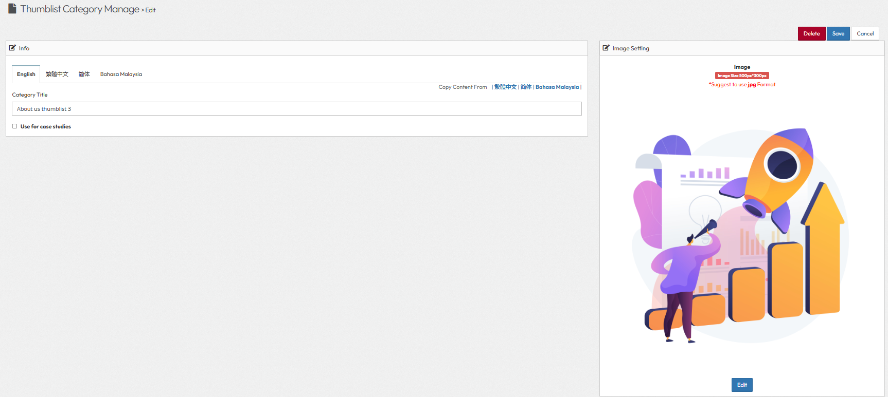
To populate this section, you must first create your Category items and attach images to them in the backend.- Navigation: Go to Data List > Thumblist Category.
- Category Configuration:
- Category Title: Enter the name of the category.
- Use for Case Studies: Toggle this option if applicable.
- Thumbnail Category Image: Upload a high-quality image representing this category.
- Recommended Size: 500px * 300px.
Step 2: Thumblist Item List (Create Content Items)
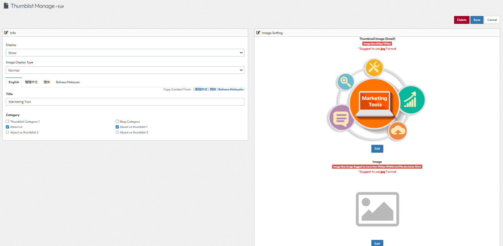
After creating the categories in Step 1, use this section to create the individual items ("Marketing Tool") that will appear inside those categories.Navigation: Go to Data List > Thumblist List .
After entering the thumblist page, click the Add Thumbnails button to create new thumblist items.
- Display: Toggle to Show or Hide .
- Image Display Type: Select how the image is rendered in the layout.
- Normal: Displays the image at its original aspect ratio.
- Multiple images: Allows for a gallery or slider format.
- Show before the images: Displays specific content or text before the visual elements.
- Detail information: Focuses on displaying detailed text or specifications.
- Video: Used for embedding video content.
- Case studies: Formats the layout specifically for case study presentations.
- Item Configuration:
- Title: Enter the name of the item (e.g., "Marketing Tool").
- Category: Select the parent category from the dropdown menu (e.g., "About us thumblist 1"). This links the item to the group created in Step 1.
- Thumbnail Image: Upload a jpg format image for this specific item. ( Image size: 600px * 375px)
Step 3: Thumblist Category List Page Configuration
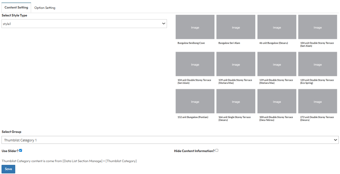
This section allows you to configure how your Thumblist Categories are displayed on the frontend.Content Setting
- Select Style Type:
- Choose the design layout for the category list (Style 1 - 3).
- A preview of the style will display on the right side when selected.
- Select Group: Select the specific category group you wish to display (e.g., Thumblist Category 1).
- Use Slider?:
- Toggle On to display items in a slider format. (image will auto slide)
- Toggle Off to display items in a static grid layout.
- Hide Content Information?:
- Toggle On to hide text details and show only images.
- Toggle Off to display the full content information.
Step 4 : Global Option Setting
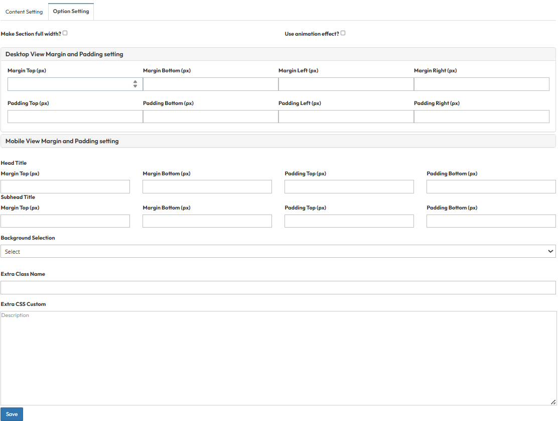
These settings control the layout container and spacing.- Make Section full width?
- Stretch content to the screen edges.
- Use animation effect?
- Enable fade-in or slide-up animations when scrolling to this section.
- Desktop View Margin and Padding setting
- Adjust external (Margin) and internal (Padding) spacing for Top/Bottom and Left/Right.
- Mobile View Margin and Padding setting
- Adjust spacing values specifically for mobile devices to fit smaller screens.
- Head Title & Subhead Title
- Adjust the spacing (Margin) above and below the Main Title and Subtitle text.
- Background Selection
- Default: Uses the standard site background (usually transparent or white).
- Background Color: Fills the section with a solid color of your choice.
- Background Image: Upload an image (Recommended size: 1920x500px).
- Parallax Effect? Toggle Yes to create a 3D scrolling effect where the background moves slower than the content.
- Background Image with Color: Combines an image with a colored overlay.
- Opacity (1-0.1): Controls the overlay strength (1 = Solid color, 0.1 = Mostly image).
- Extra Class Name
- Enter a custom CSS class name .
- Extra CSS Custom
- Paste custom CSS code here.