Part 1 : Thumblist Overview
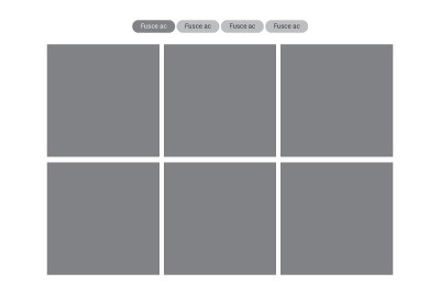
Section Type: ThumblistThis section allows you to organize and display a list of content items, such as links, resources, or features, in a structured Thumblist format. It helps users quickly scan through grouped information with titles and descriptions, making it easier to navigate through multiple related topics.
Thumblist vs. Thumblist Category List
- Standard Thumblist : Designed for direct content display. It is best for simple, linear lists where you manually define links and descriptions (e.g., a list of downloadable PDFs or a simple "Quick Links" menu). Items are added directly within the section configuration.
- Thumblist Category List: Designed for dynamic categorization and filtering. It functions as a visual hub where items are grouped by categories. This is used when you have a large database of items (like a portfolio or blog) that needs to be filtered by topic, rather than a simple static list.
- Best for:
- Resource Directories: Use this to list downloadable files, articles, or external links grouped by category (e.g., "Technical Guides" vs. "User Manuals").
- Service Highlights: Ideal for displaying a concise list of services or products with a brief description for each.
- Quick Links: Perfect for a "Quick Access" menu where users can scan titles and jump to specific pages.
Part 2 : How to Configure Your Section
Follow these steps to configure the layout, typography, and content items.
Section 1 : Headings Style & Alignment
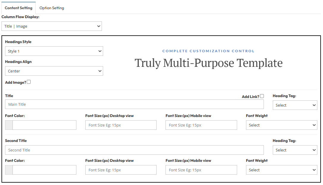
- Column Flow Display: Set as Title | Image. This arranges the main header elements side-by-side.
- Headings Style: Select Style 2.
- Headings Align: Choose the alignment (Left, Center, Right) for your header text.
- Add Image?: Toggle to include a featured header image.
- Main Title & Second Title:
- Heading Tag: Select H1, H2, H3, etc.
- Font Color & Size: Set specific colors and pixel sizes for Desktop vs. Mobile.
- Font Weight: Select Bold, Normal, etc.
Section 2 : Thumblist Type & Section
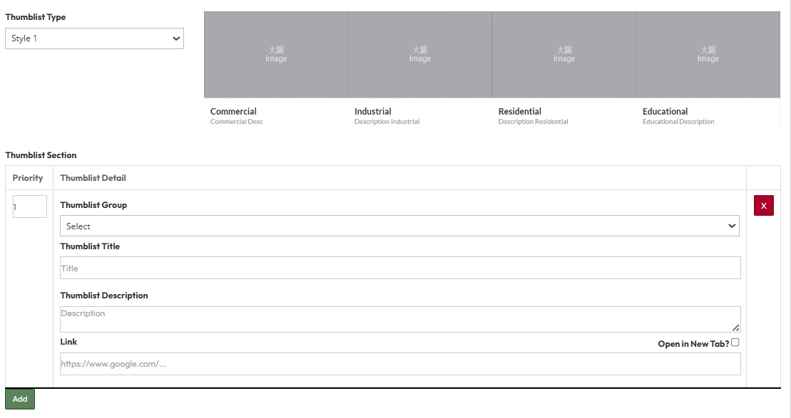
- Thumblist Type: Select the visual layout style (Style 1 - 7). A preview of the selected style will appear on the right side of the editor.
- Thumblist Section:
- Thumblist Group: Assign a category or group name to organize items (e.g., "Category A").
- Thumblist Title: Enter the main headline for the list item.
- Thumblist Description: Add a short summary or details.
- Link: Paste the destination URL.
- Open in New Tab?: Toggle Yes to open the link in a new window.
Part 3: Global Option Setting
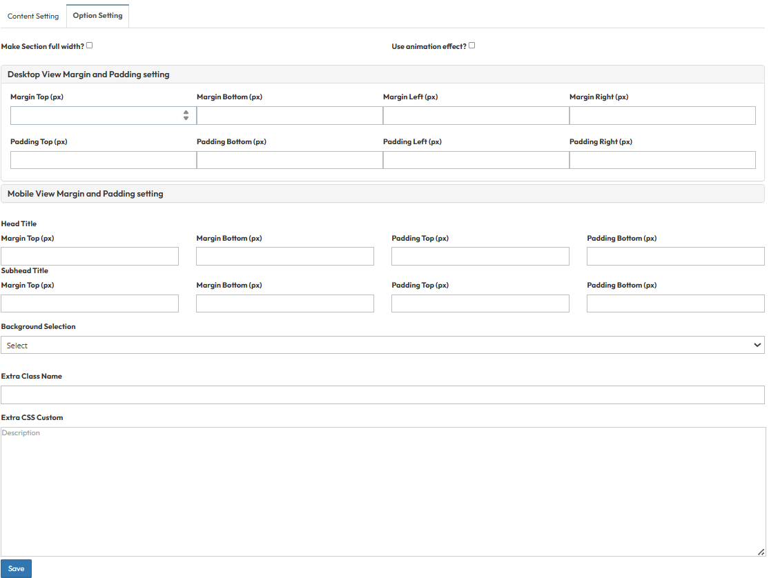
These settings control the layout container and spacing.- Make Section full width?
- Stretches content to the screen edges.
- Use animation effect?
- Enable fade-in or slide-up animations when scrolling to this section.
- Desktop View Margin and Padding:
- Adjust external (Margin) and internal (Padding) spacing for Top/Bottom and Left/Right.
- Mobile View Margin and Padding:
- Adjust spacing values specifically for mobile devices.
- Head Title & Subhead Title:
- Adjust the spacing (Margin) above and below the Main Title and Subtitle text.
- Background Selection:
- Default: Uses the standard site background.
- Background Color: Fills the section with a solid color.
- Background Image: Upload an image (Recommended size: 1920x500px).
- Parallax Effect?: Toggle Yes to create a 3D scrolling effect.
- Background Image with Color: Combines an image with a colored overlay.
- Opacity (1-0.1): Controls the overlay strength (1 = Solid color, 0.1 = Mostly image).
- Extra Class Name:
- Enter a custom CSS class name for specific styling.
- Extra CSS Custom:
- Paste custom CSS code to override default styles.