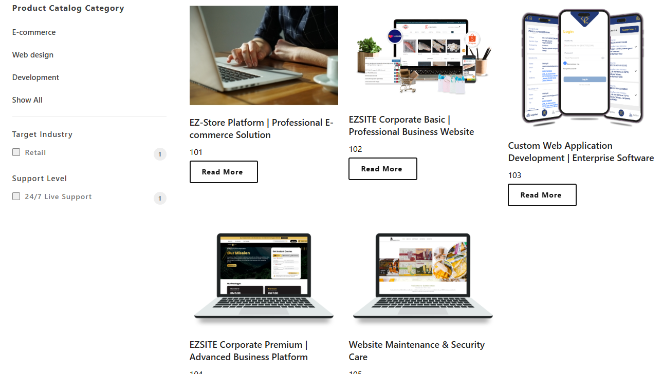
Part 1: Product Catalog (Feature) Overview
Section Type: Product Catalog (Feature)Unlike the standard Product Catalog (which displays a grid/list), the Feature section is designed to highlight specific products in a detailed, editorial layout (e.g., "Left Image Right Content"). It focuses on storytelling and detailed presentation for high-priority items rather than a browsable directory.
Key Use Cases:
- Homepage Highlights: Showcase a "Star Product" or "Service of the Month" with a large image and detailed description.
- Landing Page Focus: Direct user attention immediately to a specific high-conversion product.
- Cross-Selling: Feature complementary products on checkout or product detail pages.
Part 2. How to Configure Your Section
Follow these steps to configure the content selection and visual appearance.
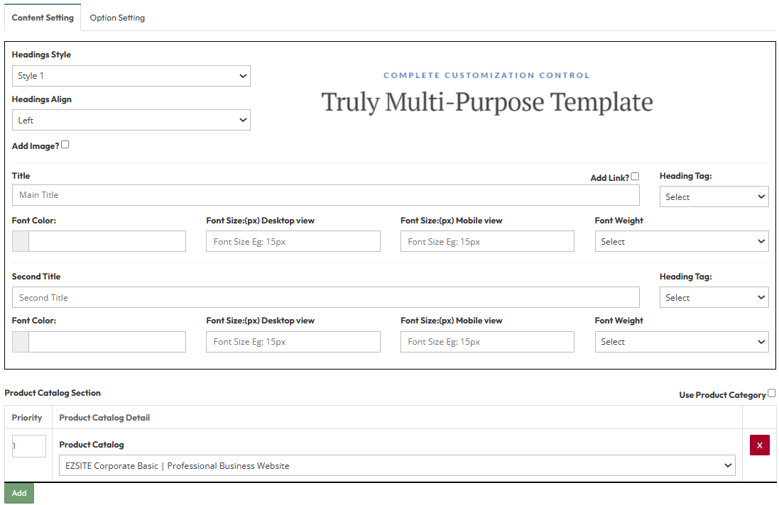
Step 1: Product Catalog (Feature) Content Setting
Configure the visual appearance and content selection.A. Layout & Style Options
- Headings Style: Select a predefined heading style (e.g., Style 1 - 8 ).
- Headings Align: Set alignment for titles (e.g., Left, Center, Right).
- Add Image?: To display the featured product image.
- Add Link?: To make the heading clickable, directing users to the full product page.
B. Typography Settings
Configure the font styles for the Main Title and Second Title:
- Heading Tag: Select the HTML tag for SEO (e.g., H1, H2, H3).
- Font Color: Pick the text color (e.g., #000000).
- Font Size: Set the pixel size for Desktop and Mobile views.
- Font Weight: Select the thickness (e.g., Bold, Normal).
C. Product Catalog Section
Select the specific content to display.
- Use Product Category: To filter items by product catelog category.
- Priority: Enter a number to set the display order (1 appears first).
- Product Catalog : Select the specific product name from your catalog list.
Step 2 : Global Option Setting
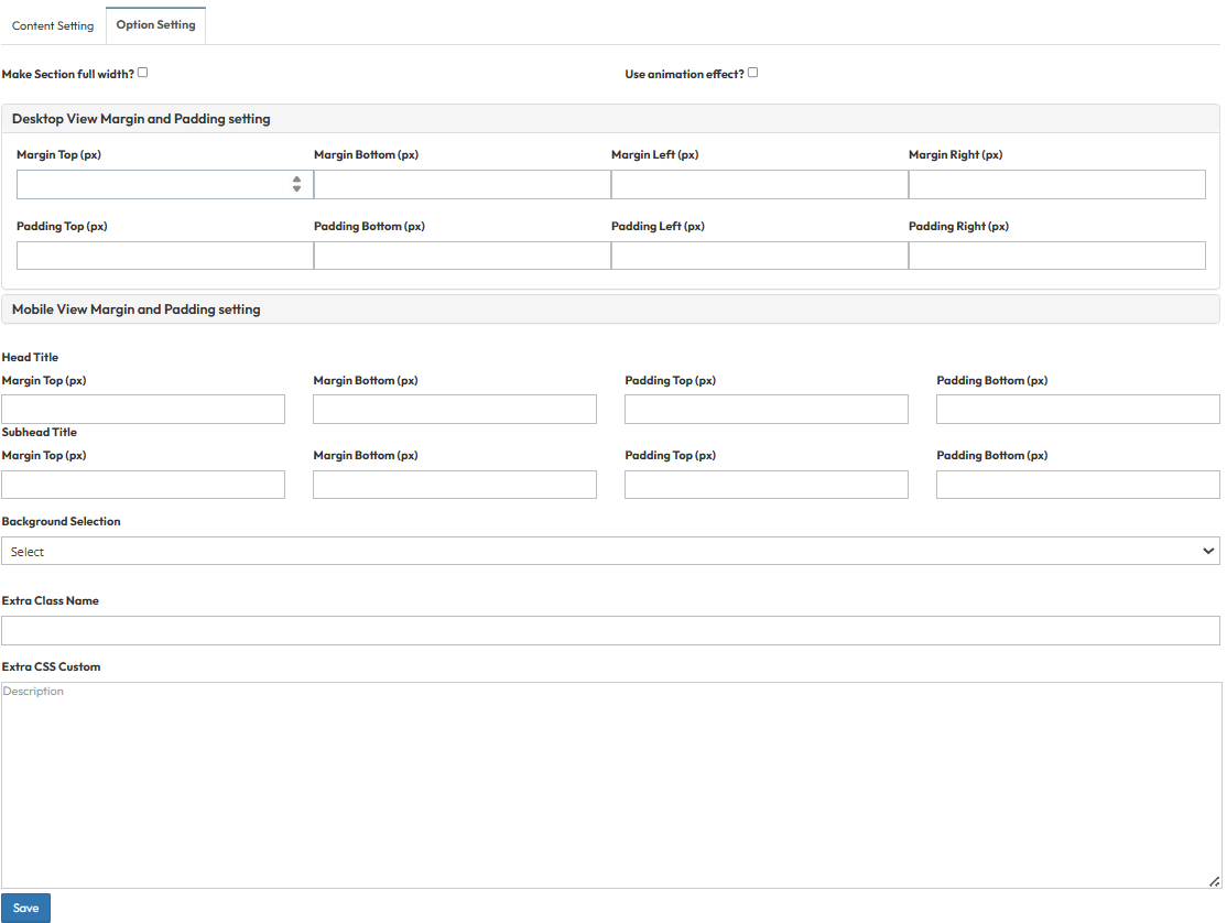
These settings control the layout container and spacing.Make Section full width?
- Stretches content to the screen edges.
Use animation effect?
- Enable fade-in or slide-up animations when scrolling to this section.
Desktop View Margin and Padding:
- Adjust external (Margin) and internal (Padding) spacing for Top/Bottom and Left/Right.
Mobile View Margin and Padding:
- Adjust spacing values specifically for mobile devices.
Head Title & Subhead Title:
- Adjust the spacing (Margin) above and below the Main Title and Subtitle text.
Background Selection:
- Default: Uses the standard site background.
- Background Color: Fills the section with a solid color.
- Background Image: Upload an image (Recommended size: 1920x500px).
- Parallax Effect?: Toggle Yes to create a 3D scrolling effect.
- Background Image with Color: Combines an image with a colored overlay.
- Opacity (1-0.1): Controls the overlay strength (1 = Solid color, 0.1 = Mostly image).
Extra Class Name:
- Enter a custom CSS class name.
Extra CSS Custom:
- Paste custom CSS code .