Part 1: Case Study Overview
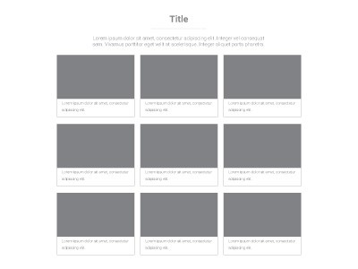
Section Type: Case StudyThis section is designed to showcase your portfolio, success stories, or detailed project examples in a structured list format. It dynamically pulls case study entries from the database, often organized by specific categories (e.g., Industries, Project Types). This layout is ideal for demonstrating expertise and real-world applications of your products or services.
Best for:
- Project Portfolio: Display a curated list of completed projects to demonstrate technical capability and experience.
- Success Stories: Highlight specific client success stories, detailing the challenge, solution, and results.
- Industry Applications: Filter and display case studies relevant to specific industries (e.g., "Retail", "F&B") using the category feature.
Part 2: How to Configure Your Section
Our backend system provides a comprehensive set of tools to customize your content blocks. Follow these steps to set up your layout perfectly:
Step 1: Content & Layout Settings
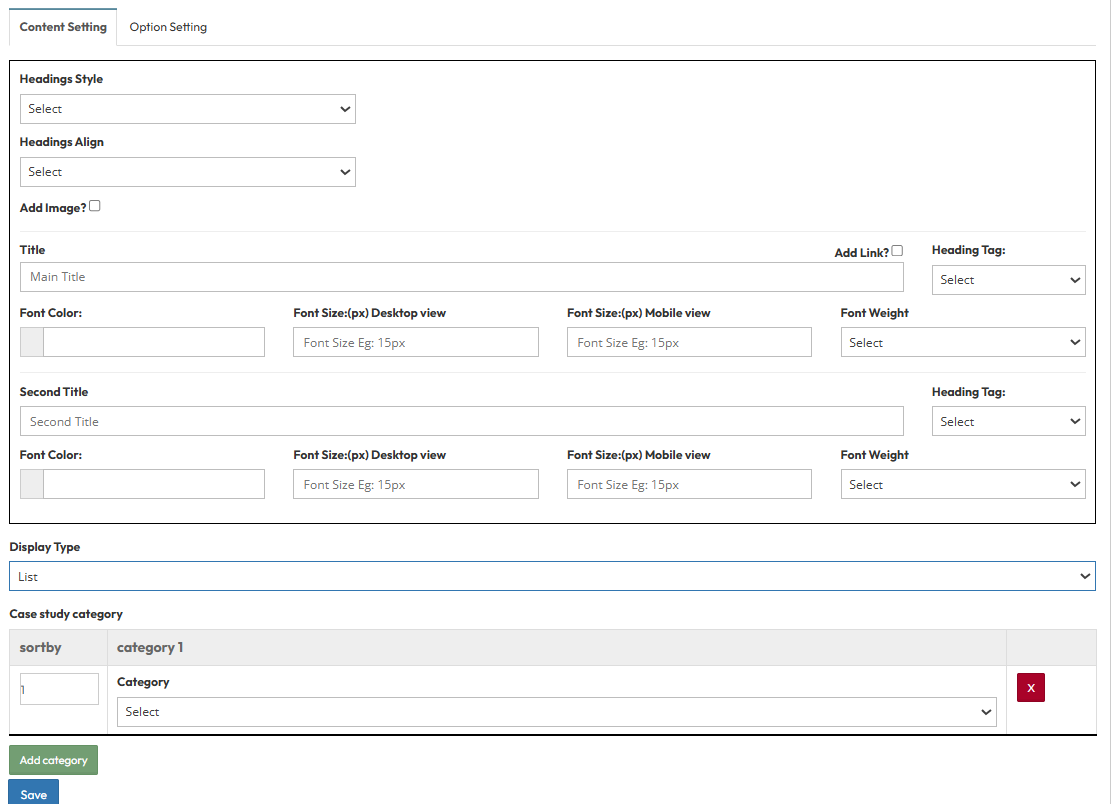
Configure how the section appears on the page.A. General Setting
- Headings Style: Select a predefined style theme. (Style 1 -8)
- Headings Align: Set alignment (Left, Center, Right).
- Add Image?: Toggle to show or hide the featured image for each case study.
B. Typography Settings
- Main Title & Second Title :
- Add Link?: Toggle to enable clickable titles linking to the detail page.
- Heading Tag: Select H1-H6.
- Font Color: Select color (e.g., #000000).
- Font Size: Set size for Desktop and Mobile.
- Font Weight: Select weight (e.g., Bold).
C. Display Settings
- Display Type: Choose List for a vertical layout or Slider for a horizontal layout.
D. Case study category
- Sort by: Enter a number to define the display order of the categories.
- Category: Select the specific Case Study Category to display in this section.
Step 2 : Global Option Setting
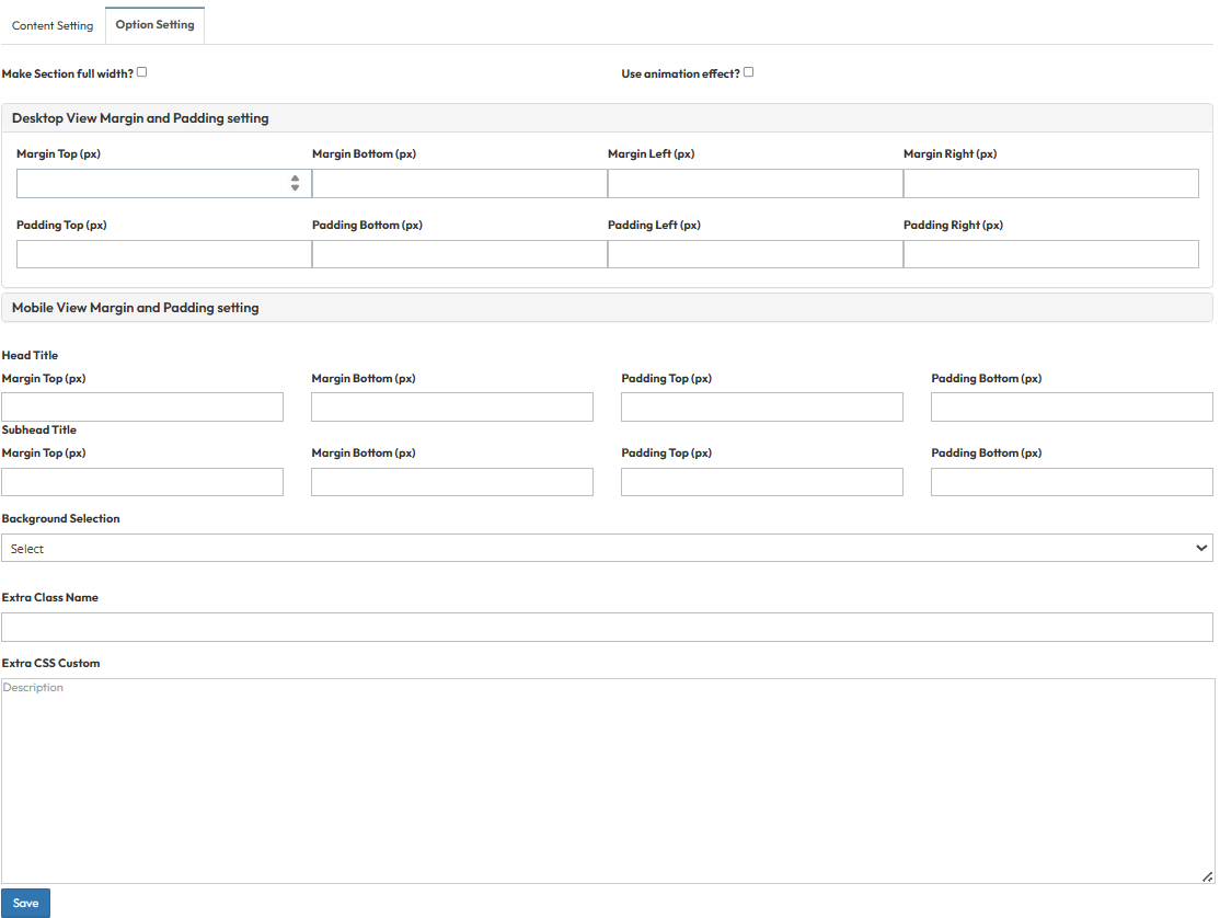
These settings control the layout container, background, and spacing.- Make Section full width?
- Stretch content to the screen edges.
- Use animation effect?
- Enable fade-in or slide-up animations when scrolling to this section.
- Desktop View Margin and Padding setting
- Adjust external (Margin) and internal (Padding) spacing for Top/Bottom and Left/Right to control layout distances.
- Mobile View Margin and Padding setting
- Adjust spacing values specifically for mobile devices to fit smaller screens.
- Head Title & Subhead Title
- Adjust the spacing (Margin) above and below the Main Title and Subtitle text.
- Background Selection
- Default: Uses the standard site background (usually transparent or white).
- Background Color: Fills the section with a solid color of your choice.
- Background Image: Upload an image (Recommended size: 1920x500px).
- Parallax Effect?: Toggle Yes to create a 3D scrolling effect where the background moves slower than the content.
- Background Image with Color: Combines an image with a colored overlay.
- Opacity (1 - 0.1): Controls the overlay strength.
- 1 = Fully opaque (Solid color, image hidden).
- 0.1 = Very transparent (Mostly image).
- Extra Class Name
- Enter a custom CSS class name to apply specific styles.
- Extra CSS Custom
- Paste custom CSS code here to override default styles for this section.