Part 1: Overlapping Columns Image Overview
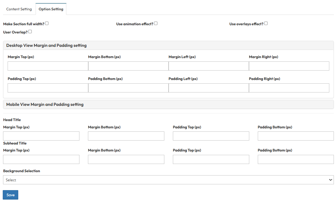
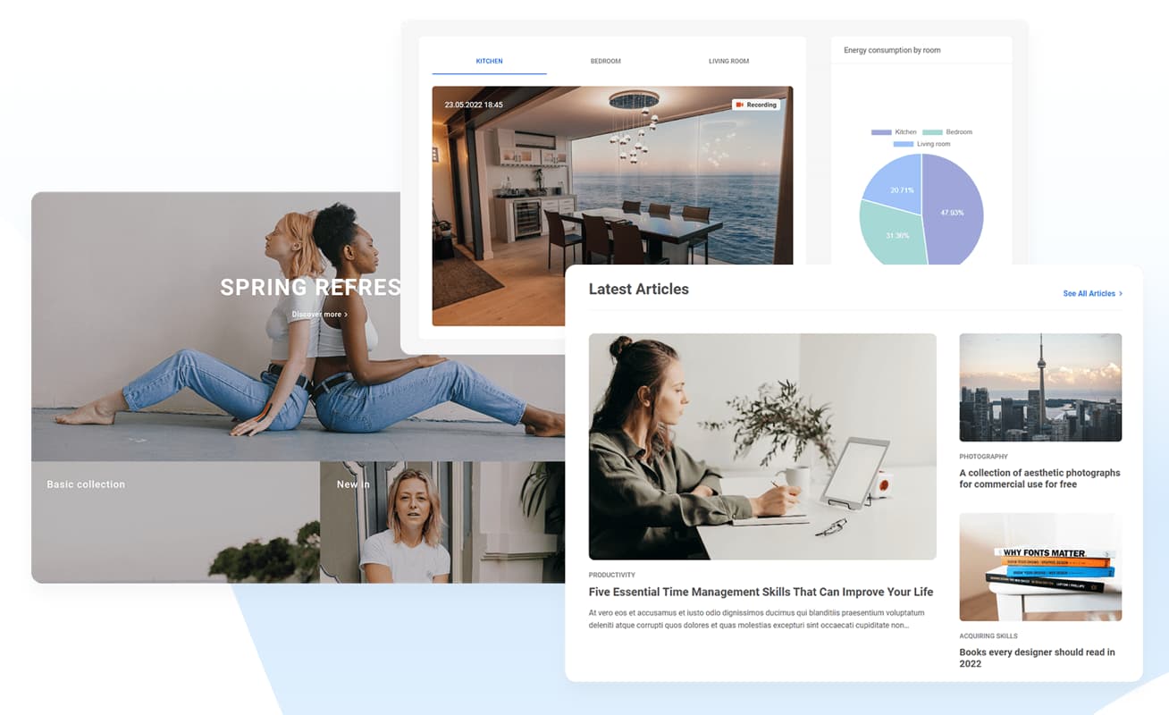
Section Type: Overlapping Columns ImageOverlapping Columns Image features a modern design where an image layer overlaps the text or background columns, creating a sense of depth and breaking the traditional grid layout. It combines a customizable colored background with transparency effects (opacity) to make your content stand out visually.
Key use cases:
- Creative Hero Sections: Use this for your landing page header to make a bold, artistic first impression.
- Modern Branding: Perfect for brands that want a non-standard, layered look to emphasize creativity and attention to detail.
Part 2 : How to Configure Your Section
Our backend system provides a comprehensive set of tools to customize your content blocks. Follow these steps to set up your layout perfectly:
Step 1: Overlapping Columns Image Configuration
Configure the background effects, typography, and overlapping image layers using the settings below.A. Visual & Background Settings
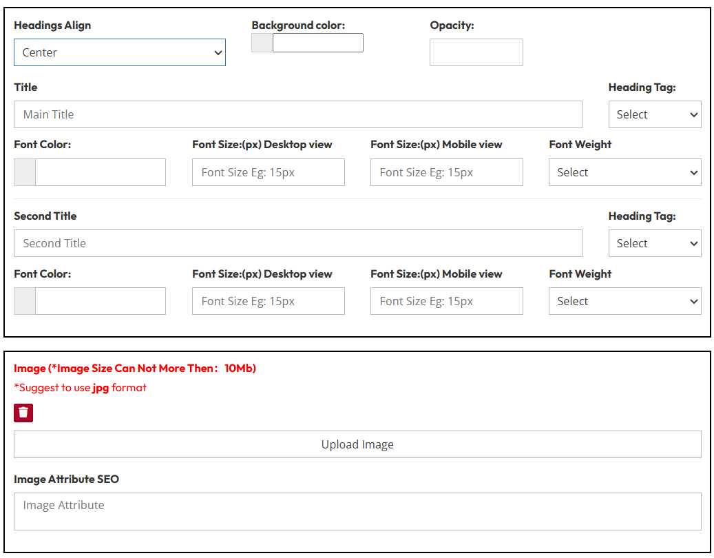
- Headings Align: Choose the alignment (Left, Center, Right) for header.
- Background Color: Select the color for the column that sits behind the text.
- Opacity: Adjust the transparency level (0 to 1) of the background color to create subtle overlay effects.
B. Headings Style
Main Title & Second Title :
- Heading Tag: Select H1, H2, H3, etc.
- Font Color & Size: Set specific colors and pixel sizes for desktop and mobile view.
- Font Weight: Select Bold, Normal, etc.
C. Image Settings
- Upload Image: Upload image for the overlapping layer. Recommended format: JPG.
- Image SEO Attribute: Enter the Alt Text (alternative text) to describe the image for search engines and accessibility.
Step 2: Description & Button Actions
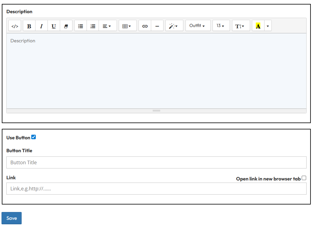
- Description: Enter the main body text.
- Button:
- Use Button: Toggle to show the Call to Action (CTA).
- Button Title: Enter the text inside button .
- Link: Enter the destination URL.
- Open link in new browser tab: Toggle Yes or No.
Step 3 : Overlapping Columns Image option setting
These settings control the layout container and spacing.- Make Section full width?
- Stretch content to the screen edges
- Use animation effect?
- Enable fade-in or slide-up animations when scrolling to this section.
- Use overlays effect?
- Adds a semi-transparent color layer over the background to ensure text is readable.
- User Overlap?
- Allows this section to visually overlap with the section above or below it, removing standard gaps.
- Desktop View Margin and Padding setting
- Adjust external (Margin) and internal (Padding) spacing for Top/Bottom and Left/Right to control layout distances.
- Mobile View Margin and Padding setting
- Adjust spacing values specifically for mobile devices to fit smaller screens.
- Head Title & Subhead Title
- Adjust the spacing (Margin) above and below the Main Title and Subtitle text.
- Background Selection
- Default: Uses the standard site background.
- Background Color: Fills the section with a solid color of your choice.
- Background Image: Upload an image (Recommended size: 1920x500px).
- Parallax Effect? Toggle Yes to create a 3D scrolling effect where the background moves slower than the content.
- Background Image with Color: Combines an image with a colored overlay.
- Opacity (1-0.1): Controls the overlay strength (1 = Solid color, 0.1 = Mostly image).