Part 1: Extra Button Overview
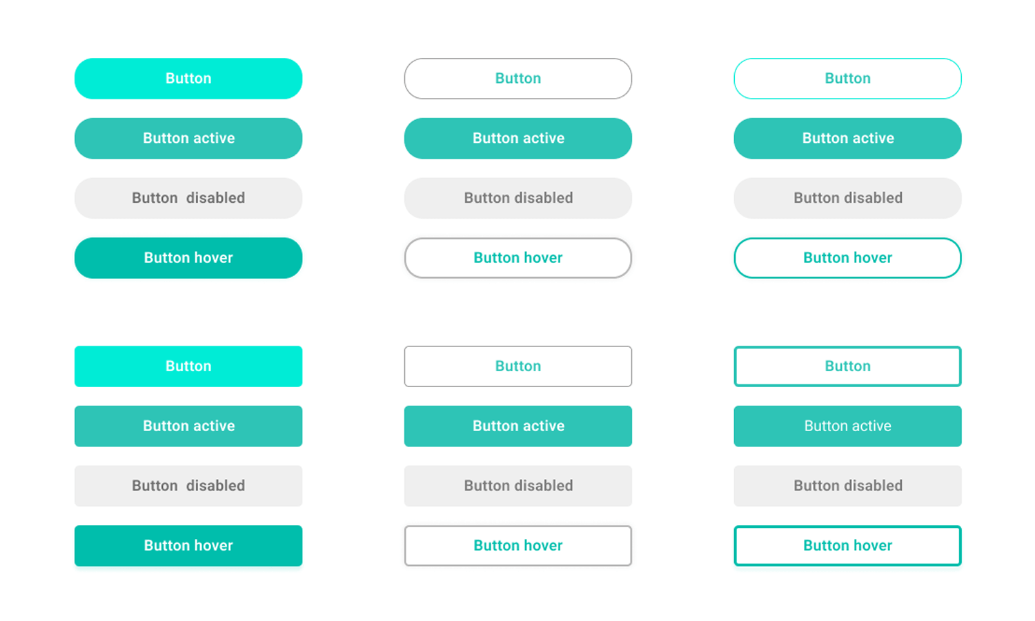
Section Type: Extra ButtonThis section creates a flexible row of action buttons designed to direct users to key pages or external resources. It functions as a quick navigation hub, allowing you to group multiple links together in one cohesive area without the need for complex layout structures.
Part 2. How to Configure Your Section
Our backend system provides a comprehensive set of tools to customize your content blocks. Follow these steps to set up your layout perfectly:
Step 1: Extra Button Configuration (Content Settings)
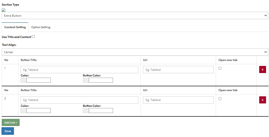
This section allows you to create a list of action buttons. You can add multiple buttons (e.g., Button 1, Button 2) and configure them individually.- Button Title: Enter the text label that appears on the button (e.g., "Download PDF", "Book Now").
- URL: Paste the destination link where the user should be directed.
- Open New Tab: Toggle Yes to open the link in a new browser window, or No to stay on the current page.
- Button Color: Select the background color for the specific button to differentiate between primary and secondary actions.
Step 2: Extra Button (Option Settings)
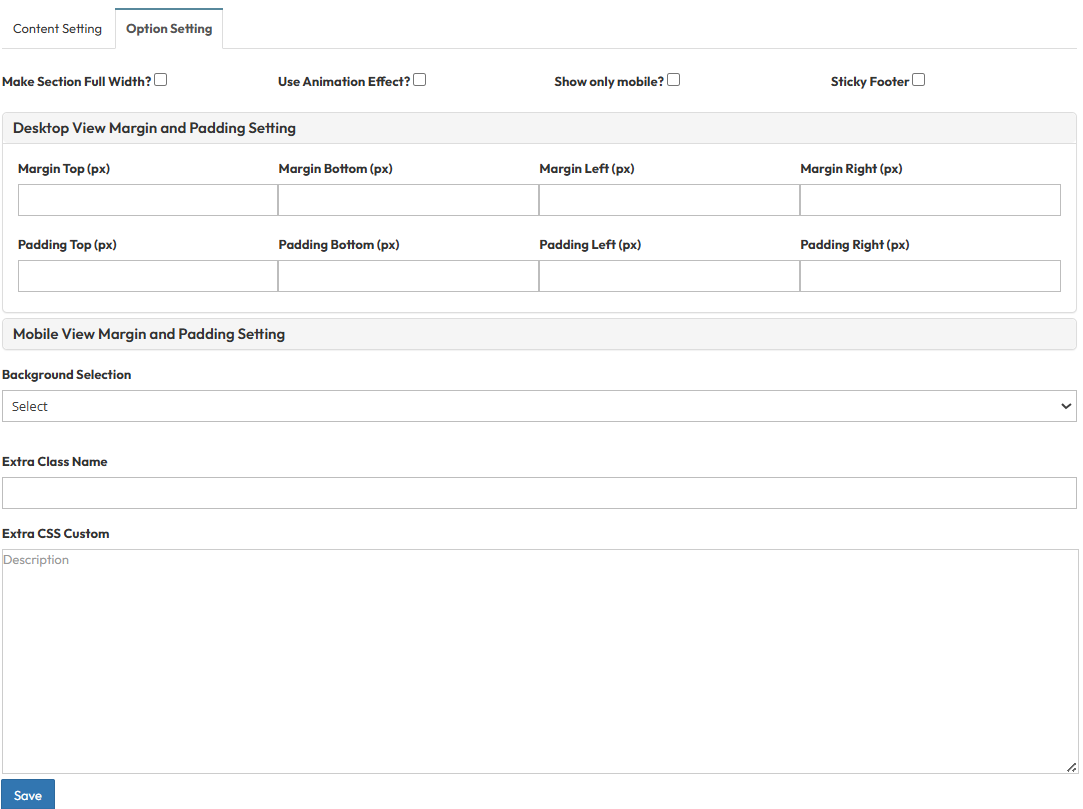
These settings control the layout container and spacing.Make Section full width?
- Stretch content to screen edges.
Use animation effect?
- Enable scroll animations.
Show only mobile?
- Toggle visibility for mobile devices only
Sticky Footer
- Toggle to fix this section to the bottom of the viewport
Desktop View Margin and Padding setting
- Adjust external (Margin) and internal (Padding) spacing for Top/Bottom and Left/Right to control layout distances.
Mobile View Margin and Padding setting
- Adjust spacing values for mobile view.
Head Title & Subhead Title
- Control spacing above and below the titles.
Background Selection
- Default: Uses the standard site background (usually transparent or white).
- Background Color: Fills the section with a solid color of your choice.
- Background Image: Upload an image (Recommended size: 1920x500px).
- Parallax Effect? Toggle Yes to create a 3D scrolling effect where the background moves slower than the content.
- Background Image with Color: Combines an image with a colored overlay.
- Opacity (1-0.1): Controls the overlay strength.
- 1 = Fully opaque (Solid color, image hidden).
- 0.1 = Very transparent (Mostly image).
Extra Class Name
- Enter custom CSS class name.
Extra CSS Custom
- Enter custom CSS code.