
Part 1: Contact Us Overview
Section Type: Contact Us (Quick Link)This section is a high-impact Call-to-Action (CTA) block designed to reduce friction for users seeking help. Unlike a full contact form, this section focuses on a single, clear objective: prompting the user to get in touch immediately via a "Quick Link" button. It typically consists of a background image (or color), a compelling Headline (Title), a supportive Subheadline (Description), and a primary Action Button.
Key Use cases:
- Pre-Footer: Position this just above the footer on every page to provide a consistent, easy path to support or sales teams.
- Pricing Page Anchor: Place this at the bottom of a pricing table to guide confused users to "Contact Sales" for custom quotes.
Part 2. How to Configure Your Section
Our backend system provides a comprehensive set of tools to customize your content blocks. Follow these steps to set up your layout perfectly:
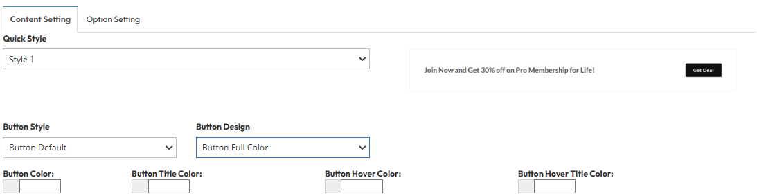
Step 1: Contact us (Quick Link) Configuration
- Content Setting
- Quick Style: This determines the structural layout. (Option : Style 1 , Style 2)
- Button Style: Select Button Default, Button Rounded, Button Circle
- Button Design: Select Button Full Color , Button Outline
- Color Configuration:
- Button Color: Set this to your Brand Primary Color (e.g., #3498db). This is the background color of the button.
- Button Title Color: Set this to White (#ffffff) for high contrast against a dark brand color.
- Button Hover Color: Choose a slightly darker shade of your brand color (e.g., #2980b9).
- Button Hover Title Color: Usually keep this the same as the standard Title Color (e.g., White) to maintain readability.
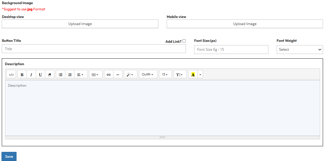
Step 2: Button title & Description
- Add Links: Enter the destination URL for the button.
- Font Size: Set the text size.
- Font Weight: Set the thickness of the text (e.g., Bold, Normal).
- Fill the content for the subheadline text. This text appears below the main title and above the button to provide context.
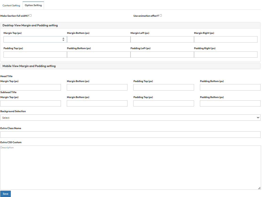
Step 3: Global Option Setting
Make Section full width?
- Stretch content to screen edges.
Use animation effect?
- Enable scroll animations.
Desktop View Margin and Padding setting
- Adjust external (Margin) and internal (Padding) spacing for Top/Bottom and Left/Right to control layout distances.
Mobile View Margin and Padding setting
- Adjust spacing values for mobile view.
Head Title & Subhead Title
- Control spacing above and below the titles.
Background Selection
- Set background color or image or default or background image with color.
Extra Class Name
- Enter custom CSS class name.
Extra CSS Custom
- Enter custom CSS code.