Part 1: Contact Form Overview
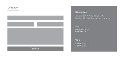
Section Type: Contact FormThis section allows you to create a direct communication channel between you and your visitors. It integrates an inquiry form, a location map, and your contact details in one cohesive layout.
Part 2. How to Configure Your Section
Our backend system provides a comprehensive set of tools to customize your content blocks. Follow these steps to set up your layout perfectly:
Step 1: Contact Form Layout & Headings (Content Settings)
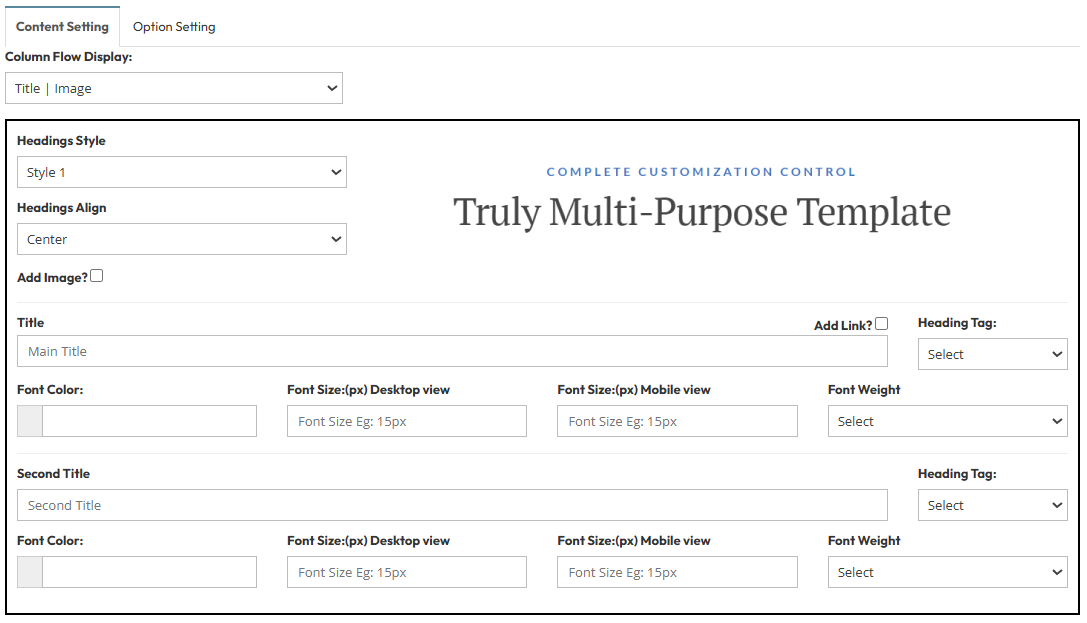
Configure the top part of your section to define how titles and optional images appear.- Column Flow Display: Choose the arrangement of your content elements (Options: Title | Image and Image | Title ).
- Headings Style: Select Style 1 for the standard design.
- Headings Align: Set alignment to Center (Options: Left, Center, Right).
- Add Image?: Toggle to upload a featured image or icon above your titles.
- Main Title & Second Title :
- Heading Tag: Select the appropriate tag (e.g., H1, H2).
- Font Color & Size: Customize the color and define sizes for Desktop (e.g., 28px) and Mobile (e.g., 20px).
- Font Weight: Select the thickness (e.g., Bold).
Step 2: Form Design & Map Integration
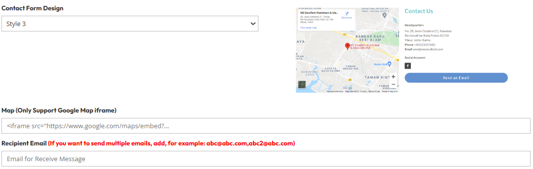
Set up the visual components where users interact.- Contact Form Design: Select the layout structure for your form fields from the available options.
- Map: Paste your Google Map iframe code here to display your location visually. This section supports standard Google Map iframe.
- Recipient Email: Enter the email address(es) that will receive the messages. (e.g., abc@abc.com, abc2@abc.com).
Step 3: Button & Interaction Options
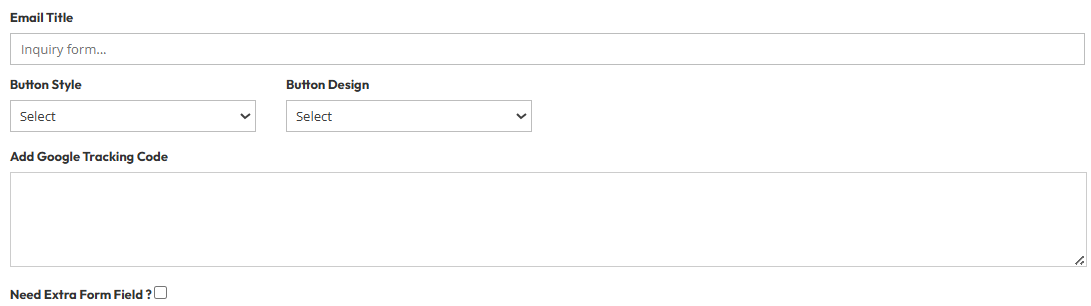
Customize the submission button and track user behavior.Button Style: Choose the visual style for the submit button.
Button Design: Select the specific design variant.
Add Google Tracking Code: Paste your analytics tracking code here (e.g., Google Analytics) to monitor form conversions.
Need Extra Form Field?: Toggle this option if you need to add custom fields (like dropdowns or checkboxes) beyond the default Name and Email
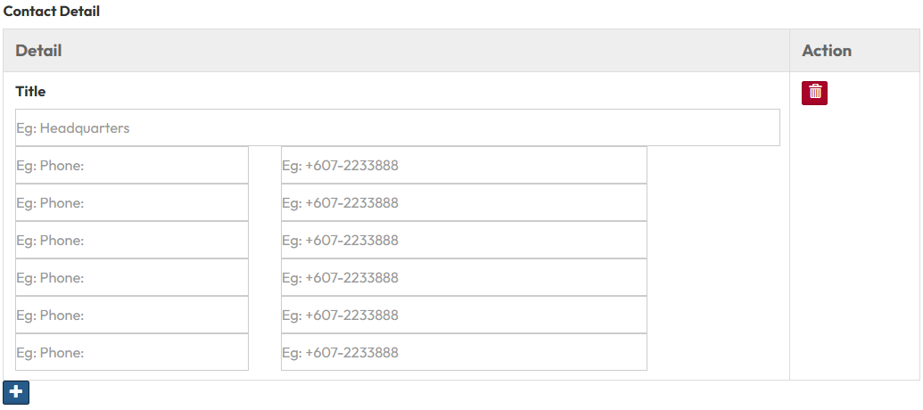
Step 4: Contact Details
Display your specific business information alongside the form.Title: Enter a label for your details (e.g., "Headquarters").
Details: Add your contact information rows.
- For Example, Label: "Phone:" | Value: "+607-2233888".
- You can add multiple rows for Address, Email, or other information
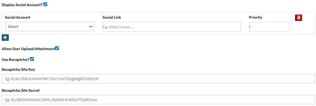
Step 5: Security & Social Features
Enable extra functionality for security and connectivity.- Display Social Account?: Select "Yes" to show icons linking to your social media profiles.
- Allow User Upload Attachment: Enable this feature to allow visitors to upload files (like documents or images) with their message.
- Use Recaptcha?: Enable Google reCAPTCHA to protect your form from spam and bot submissions.
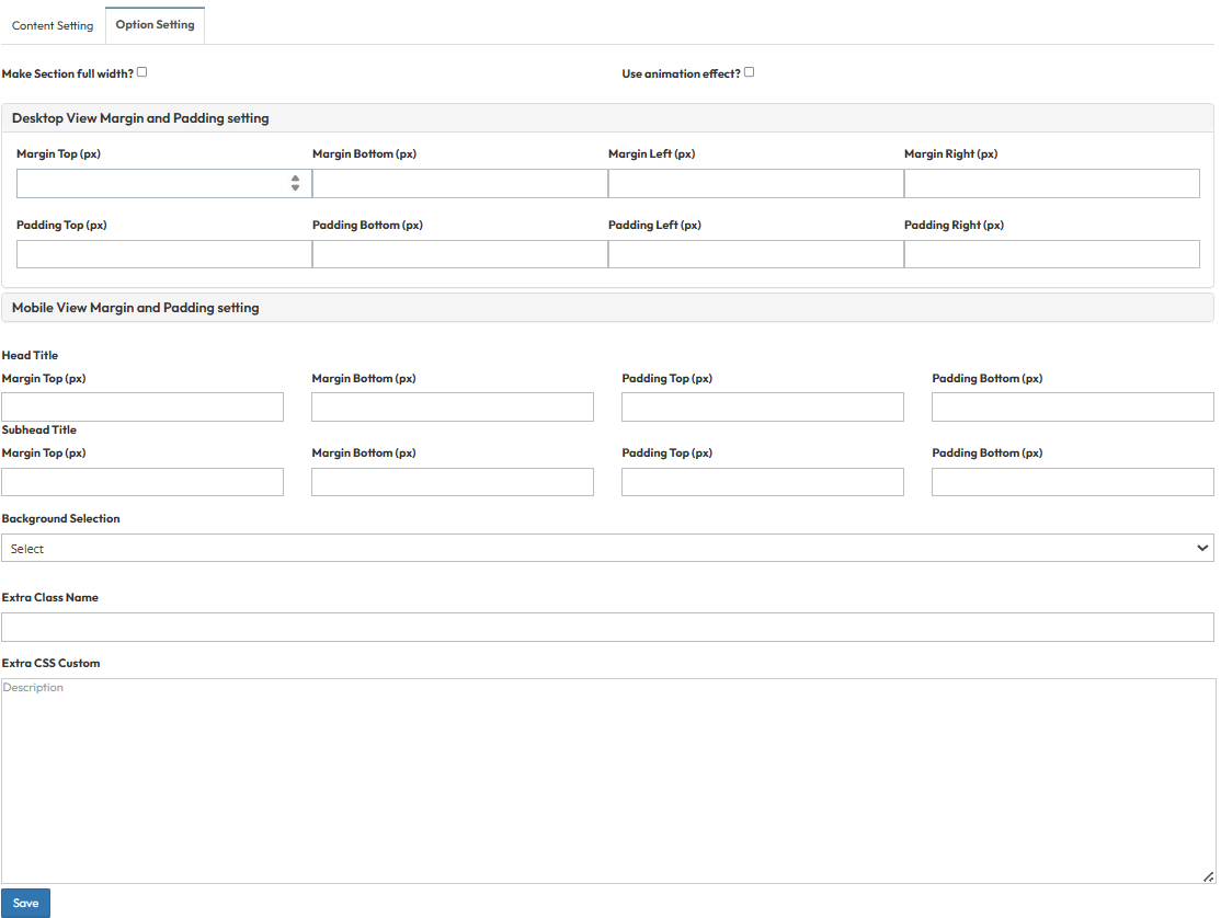
Step 6 : Global Option Setting
- Make Section full width?
- Stretches content to the screen edges.
- Use animation effect?
- Enable fade-in or slide-up animations when scrolling to this section.
- Desktop View Margin and Padding:
- Adjust external (Margin) and internal (Padding) spacing for Top/Bottom and Left/Right.
- Mobile View Margin and Padding:
- Adjust spacing values specifically for mobile devices.
- Head Title & Subhead Title:
- Adjust the spacing (Margin) above and below the Main Title and Subtitle text.
- Background Selection:
- Default: Uses the standard site background.
- Background Color: Fills the section with a solid color.
- Background Image: Upload an image (Recommended size: 1920x500px).
- Parallax Effect?: Toggle Yes to create a 3D scrolling effect.
- Background Image with Color: Combines an image with a colored overlay.
- Opacity (1-0.1): Controls the overlay strength (1 = Solid color, 0.1 = Mostly image).
- Extra Class Name:
- Enter a custom CSS class name for specific styling.
- Extra CSS Custom:
- Paste custom CSS code to override default styles.